
Quds Paints Industry was established in 1994. It started with two lines of products,Water-born Interior Walls putty and Cement-base tile adhesive.
Quds Paints Industry paints company in jordan
Eco-Friendly
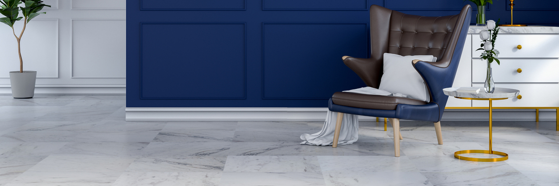
Paint Color Coordination: Ideas for Combining Two Colors in One Room | Quds Paints
Recent Post



Paint Color Coordination: Ideas for Combining Two Colors in One Room | Quds Paints

- November 08, 2026
The Art of Paint Color Coordination: How to Combine Multiple Colors in One Room Elegantly
Choosing the right paint colors is one of the most important elements of interior design. Colors do more than simply enhance the appearance of walls; they influence the atmosphere and visual identity of a space, shaping the overall sense of comfort, spaciousness, and warmth within a home.
With the evolution of interior design trends, using a single color throughout a room is no longer the only option. Combining two or more paint colors has become a popular modern design approach, adding character to interior spaces, highlighting architectural details, and creating visual depth that complements furniture and lighting.
However, achieving a harmonious look involves more than simply choosing beautiful colors. It requires understanding how to distribute them, how they work together, and how to consider the room's dimensions and surrounding lighting.
So, how can you choose two complementary colors for one room? And what are the best ways to distribute them across the walls? In this article, we explore the essential rules of paint color coordination, along with a selection of color combinations inspired by the Quds Paints color collection.
Why Is Combining Two Colors in One Room a Great Choice?
Using two different colors in a room allows you to introduce attractive design elements without overwhelming the space with too many shades. It also helps define specific areas and highlight interior design features in a thoughtful way.
Some of the main benefits of combining two paint colors include:
◉ Adding a Personal Touch: Combining colors allows you to express your personal taste and give the room a distinctive identity.
◉ Highlighting Architectural Details: A different color can be used to draw attention to a particular wall, corner, or architectural feature.
◉ Creating Visual Balance: Choosing complementary shades helps connect the walls with the furniture, curtains, and flooring.
◉ Adding Depth and Character: Different color shades create more attractive visual dimensions and prevent the space from looking monotonous.
Essential Rules for Combining Two Paint Colors in One Room
To achieve an elegant and balanced result, choosing colors should never be a random process. There are several important guidelines that can help you create harmony between different shades and distribute them according to the room's characteristics.
1. Choose a Main Color and Another to Highlight Key Features
This is one of the easiest and most popular approaches to color coordination. It involves choosing a light shade as the main color for most of the walls, then introducing a darker shade to highlight one wall or a specific area.
For example, you can combine Sand Castle with Coffee. The sandy shade creates a warm and calming atmosphere, while the brown shade adds visual depth and a touch of elegance.
It is generally recommended that the main color cover a larger area than the accent color to maintain visual balance throughout the room.
2. Choose Colors That Complement Each Other
The two colors do not necessarily have to be similar to work well together. Harmony can be achieved by combining closely related shades or by creating a carefully balanced contrast between two different colors.
For example, combining Creama Ash with Cream Latte creates a calm appearance that blends shades of grey, beige, and cream. Meanwhile, pairing Jasmine with Yaqout introduces an elegant contrast between light grey and olive green.
The most important thing is to ensure that both shades complement the other elements of the room rather than considering each color individually.
3. Consider the Effect of Lighting
Natural and artificial lighting have a direct impact on how paint colors appear. The same shade may look warmer, cooler, or brighter depending on the direction of the windows, the amount of natural light, and the color temperature of the lighting fixtures.
For this reason, it is recommended to test samples of both colors on the wall and observe how they look at different times of the day, under both natural sunlight and artificial lighting, before making your final decision.
4. Consider the Room Size and Ceiling Height
Room dimensions play an important role in choosing and distributing paint colors. Light shades such as Jasmine and Cream Latte can often make smaller spaces feel brighter and more spacious.
On the other hand, darker shades such as Ocean and Coffee can be used to add depth and character, especially when applied to a single accent wall.
You should also consider the ceiling height and the amount of natural light available. Using dark colors extensively in small or poorly lit rooms may make the space feel more confined.
Modern Ideas for Using Two Paint Colors in One Room
After choosing the right colors, the next important step is deciding how to apply them to the walls. There are several techniques you can use depending on the room's layout and the desired visual effect.
1. The Accent Wall
The accent wall is one of the most popular paint coordination techniques in interior design. It involves painting one wall in a different color from the remaining walls, making it the main focal point of the room.
You can choose a rich or dark shade such as Coffee or Ocean for the accent wall, while using a lighter shade such as Cream Latte or Jasmine for the remaining walls.
This approach works particularly well in living rooms and bedrooms, especially when highlighting the wall behind the bed or the wall facing the seating area.
2. Distributing Two Colors Across Different Walls
Another way to achieve a balanced look is to distribute two colors across the room's walls. For example, you can use the lighter shade on two walls and the second color on one wall to create a distinctive visual feature.
Suitable combinations for this approach include Sand Castle with Coffee, or Jasmine with Yaqout.
This technique introduces visual variety while maintaining a simple and harmonious interior design.
3. Dividing a Wall into Two Colors
Dividing a wall into two different colors creates a modern and distinctive design. This technique can be applied horizontally or vertically, depending on the room's shape and the desired appearance.
For a horizontal design, you can use Cream Latte on the upper section of the wall and Creama Ash on the lower section, creating a balanced look that combines creamy and grey tones.
Vertical color divisions can also be used to highlight a specific section of the wall or introduce a geometric design that complements the furniture and overall decor.
Best Two-Color Combinations from Quds Paints for Your Home
If you are looking for practical ideas that combine elegance and harmony, here are some color combinations to consider when designing your home's interior, along with suggestions on how to use each pairing.
Sand Castle and Coffee
This combination brings together sandy beige and brown tones to create a warm and elegant atmosphere. You can use Sand Castle as the main color for most of the walls, while dedicating one wall to Coffee to add depth and create a distinctive focal point.
Cream Latte and Creama Ash
This combination blends creamy tones with greige (a mix of grey and beige), making it ideal for those who appreciate calm and contemporary interiors. Cream Latte helps keep the space bright, while Creama Ash introduces a subtle contrast that gives the walls a balanced appearance.
Jasmine and Yaqout
This combination brings together light grey and olive green, creating a natural-inspired atmosphere. You can use Jasmine as the main wall color and apply Yaqout to an accent wall for an elegant and distinctive touch.
Jasmine and Ocean
If you prefer a more noticeable contrast with a modern feel, combining Jasmine and Ocean is an excellent option. The light grey shade creates a bright and calming atmosphere, while the dark blue adds depth and character to the space.
Sand Castle and Creama Ash
This combination blends sandy tones with greige, creating a neutral appearance that balances warmth and modern style. It is an ideal choice for those who prefer calm interiors that can easily complement different furniture and decor styles.
Common Mistakes to Avoid When Coordinating Paint Colors
Choosing the right colors can lead to beautiful results, but a few small mistakes may affect the overall appearance of the room. Here are some common mistakes to avoid:
1️⃣ Choosing Two Colors Without Checking Their Compatibility: Each color may look beautiful on its own, but combining them on the walls may not produce the desired result.
2️⃣ Using Too Many Dark Colors: Applying dark shades across large areas, especially in small rooms, can make the space feel more confined.
3️⃣ Ignoring the Effect of Lighting: Colors can appear differently under different lighting conditions, so you should not rely solely on how a shade looks in a color catalogue.
4️⃣ Overlooking Furniture and Flooring: Wall colors should complement the curtains, furniture, and flooring to create a cohesive interior design.
5️⃣ Skipping Paint Sample Testing: It is always better to test both colors on a small section of the wall before applying them throughout the entire room.
How to Choose the Right Paint Colors for Every Room in Your Home
Choosing paint colors should not depend on personal taste alone. It should also reflect the purpose of each room and the atmosphere you want to create.
◎ Bedrooms: Soft and relaxing shades such as cream, light grey, and beige are ideal. You can also introduce a darker color behind the bed to highlight the wall.
◎ Living Rooms: These spaces offer more opportunities for creativity, whether through warm earthy tones or modern contrasting colors.
◎ Dining Rooms: Warm and complementary shades can create a comfortable atmosphere, while a different accent color can be used to highlight one of the walls.
◎ Children's Rooms: Combining light and cheerful shades with an additional accent color can create a lively atmosphere without overwhelming the space.
In all cases, remember to consider the room's size, lighting, and furniture before finalizing your color combination.
Quds Paints... Color Choices That Inspire Your Interior Design
A distinctive interior design begins with choosing colors that reflect your personal taste and complement the character of your space. That is why Quds Paints offers a diverse range of color shades, giving you multiple options for coordinating your walls and transforming your ideas into spaces that combine beauty and comfort.
From soft shades such as Jasmine and Cream Latte, to earthy colors such as Sand Castle and Creama Ash, and more distinctive tones such as Yaqout, Ocean, and Coffee, you can explore different combinations to suit a variety of interior design styles.
The art of paint color coordination does not require using a large number of colors. Instead, it is all about choosing complementary shades and distributing them thoughtfully to create balance between the walls, furniture, and lighting.
Sometimes, two well-coordinated colors are all you need to give a room a modern and elegant appearance that reflects your personality and makes your home more beautiful and comfortable.
Explore the Quds Paints color collection, choose the shades that match your taste, and start creating a space that reflects your personal style.
Contact Us to discover the paint colors and products best suited to your project.